1. Clean, Minimalist Layouts with Clear CTAs
What is it (In Depth):
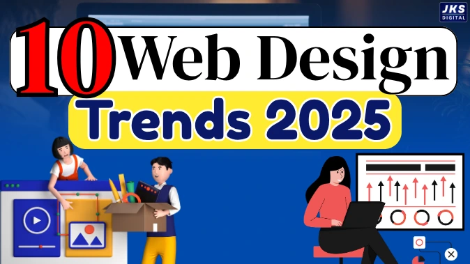
2025 Most Effective Website Design Trends:- A clean and minimalist layout means designing a website that is simple, clutter-free, and easy to navigate. Instead of filling every space with images, text, buttons, and menus, it focuses on showing only the most important elements that guide the visitor toward a specific goal—like signing up, calling you, or making a purchase.
For example, imagine visiting a website where there’s just one bold headline, one image, and a single button that says, “Get Started” or “Book a Free Call.” There’s no confusion about where to go or what to do next. That’s minimalist design with a clear call-to-action (CTA).
This trend works by reducing distractions and keeping the user’s attention focused on the next step you want them to take.
2.Hyper-Personalized User Experiences
What is it (In Depth):
Personalization in web design refers to changing or adapting website content based on the individual visitor’s behavior, preferences, or characteristics. This could include things like showing different homepage banners depending on the user’s location, recommending products based on what they browsed earlier, or displaying time-sensitive offers based on the time of day.
Think about how Netflix shows you different shows compared to someone else based on your viewing habits. Similarly, an e-commerce website might suggest “Products you may like” based on your last visit. That’s hyper-personalization in action.
Modern websites use cookies, browser data, and even AI to make the site feel custom-made for each visitor—making them more likely to stay, explore, and eventually buy or take action.
3. Lightning-Fast Loading Times (Core Web Vitals Focus)
What is it (In Depth):
This trend is all about speed. It refers to designing websites that load quickly—ideally within 1 to 3 seconds—especially on mobile devices and slower internet connections. Google introduced Core Web Vitals as a set of performance standards that measure how fast and stable your website feels to users.
For example, if someone opens your website and it takes more than 5 seconds to load, chances are they’ll hit the back button and leave. On the other hand, if it opens instantly and everything feels smooth, they’ll stay and explore.
Achieving this speed involves using optimized images, clean code, content delivery networks (CDNs), and fast hosting. A fast-loading site not only improves user experience but also helps in better search engine rankings.
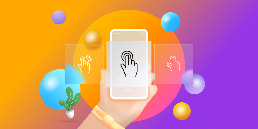
4. Interactive Elements & Micro-Animations
What is it (In Depth):
Interactive elements are small design features that respond to user actions. Micro-animations are tiny animations that play when users hover, click, scroll, or perform any interaction on your site. These are not big flashy videos or effects—they’re subtle, like a button that moves slightly when hovered over, or a loading bar that animates while a form is being submitted.
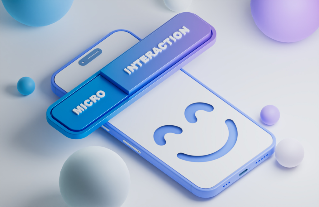
Such interactions help guide users, show that the site is responding to them, and make the whole experience feel dynamic and modern.
For example, when you hover over a product image and it zooms in slightly or flips to show the back view—that’s a micro-interaction. It adds polish to your website and builds trust through interactivity.
5. Mobile-First and Thumb-Friendly Design
What is it (In Depth):
Mobile-first design means building your website primarily for smartphones and small screens before adapting it for desktops. It’s the opposite of the old method where websites were built for large screens and then adjusted for mobile.
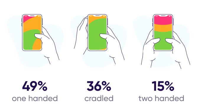
With over 60–70% of web traffic now coming from mobile devices, it makes sense to focus on how your website looks and functions on smaller screens.
Thumb-friendly design ensures that buttons, menus, and interactive elements are placed in areas easily reachable by thumbs. For example, placing the “Add to Cart” button at the bottom-center of the screen rather than the top corner makes it easier to tap.
This design principle improves usability and makes mobile visitors more likely to complete actions like making a purchase or filling out a form.
6. Conversational Interfaces (Chatbots, Live Chat, AI Assistants)
What is it (In Depth):
Conversational interfaces refer to tools like live chat windows or AI-powered chatbots that allow users to interact with your website as if they were talking to a human assistant.

Instead of digging through menus or pages, users can ask questions directly like, “What’s your pricing?” or “Do you offer services in Mumbai?”—and get instant answers.
These chat interfaces can be simple (like a human agent responding in real time) or advanced (powered by AI that understands and responds based on pre-set flows or machine learning). They are especially helpful for guiding new visitors, capturing leads, or solving quick queries.
This trend is growing because users prefer instant help without having to call or wait for emails.
7. Scroll-Based Storytelling & Animations
What is it (In Depth):
Scroll-based storytelling is a creative web design approach where the content unfolds gradually as the user scrolls, creating a more immersive and narrative-driven browsing experience. Rather than showing all information at once, elements appear, move, or change step-by-step in a smooth, animated way.
Imagine you’re on a homepage and as you scroll, an animated product starts rotating, text appears explaining each feature, and a video plays automatically in the background—this is storytelling through design.
This approach makes the website feel like an interactive presentation or visual journey. It’s especially effective for explaining a product, showcasing a company’s journey, or building emotional connection.
8. Accessibility-Focused Design
What is it (In Depth):
Accessibility design ensures your website can be used by everyone, including people with visual, hearing, cognitive, or physical impairments.
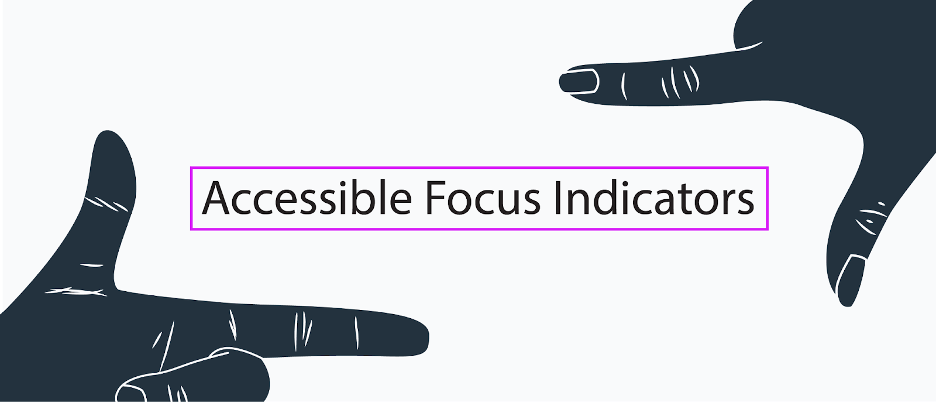
This includes things like:
- Providing alt text for images
- Using high contrast between text and background
- Allowing keyboard navigation (for people who can’t use a mouse)
- Screen-reader compatibility
- Avoiding auto-play sounds
In many parts of the world, ensuring accessibility isn’t merely a best practice—it’s mandated by law to protect user rights and promote equal digital access. More importantly, it shows that your brand is inclusive and cares about all users.
Accessible websites reach more people and often have better SEO performance, too.
9. Trust Signals in Prominent Places
What is it (In Depth):
Trust signals are elements on your website that help build credibility with visitors. This includes:

- Customer testimonials
- Reviews
- Security assurance icons such as “Payment Protected” or “Verified Seller” serve as visual trust signals that help users feel more confident while browsing or making purchases.
- Client logos
- Industry certifications
- Social proof (like “10,000+ customers served”)
In 2025, brands are placing these trust elements right at the top of the page or close to action buttons. Users don’t scroll down to find proof anymore—they expect to see it quickly.
It builds confidence and reassures the user that your brand is real, safe, and reliable.
10. Dark Mode and Soft UI
What is it (In Depth):
Dark mode is a color scheme that uses dark backgrounds with light text, offering a more visually comfortable experience, especially at night. Soft UI, also known as neumorphism, uses subtle shadows and depth effects to create a smooth, 3D look.
Many users now prefer dark mode because it reduces eye strain and saves battery on mobile devices. That’s why modern websites are offering “theme switchers” or designing in soft dark tones by default.
This trend gives your website a modern, premium feel and can increase the amount of time users spend exploring it.
Read Also:- How to Make Money with YouTube Studio – Top Secrets
Conclusion:
In 2025, website design is no longer just about looking good—it’s about delivering powerful user experiences, building trust, and boosting conversions. With trends like conversational interfaces, scroll-based storytelling, and accessibility-focused design, websites are becoming more interactive, engaging, and inclusive than ever before.
By adopting these modern design approaches, you’re not just improving how your site looks, but also how it connects with users. That’s the difference between an ordinary website and a high-performing one.
